What about composition? Characterisation? Perspective?! The golden ratio?!!
Anyone who said that last one can ignore this post if they want. I give you permission to leave now.
Go on. Are you out the door yet?
I’m kidding. But seriously, lighting is a powerful tool. And I’m going to be showing you some examples today that will highlight 😃😉 the amazing way in which lighting effects give depth, emotion, and even tell a story in our art.
All right! Ready to dig in?
Walkthrough: Fire Outside the Hold
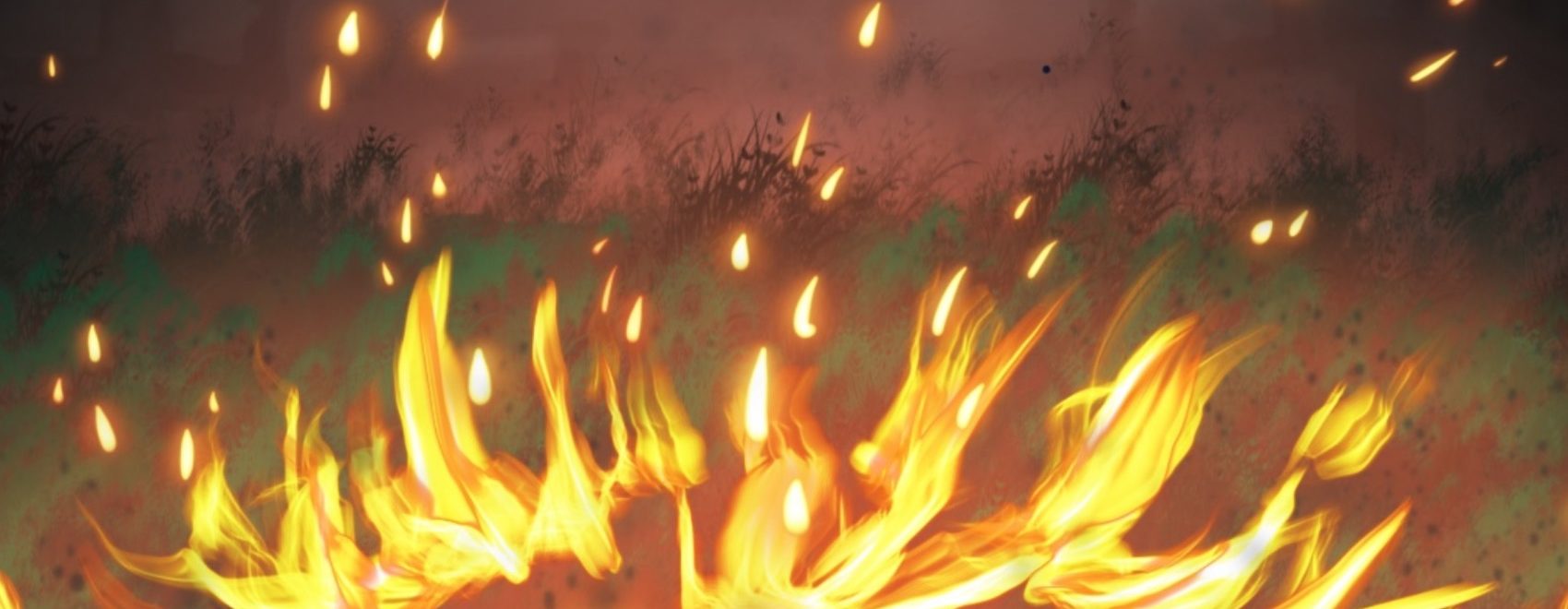
So, the example I want to make is from the featured image of this blog. It’s a picture of fire outside castle walls, and even now, years later, I’m really happy with it. Why? Because despite the fact my hand-made grass brush didn’t look so great, the lighting and mood of this illustration make it look almost like it’s a still from an animated tv show.
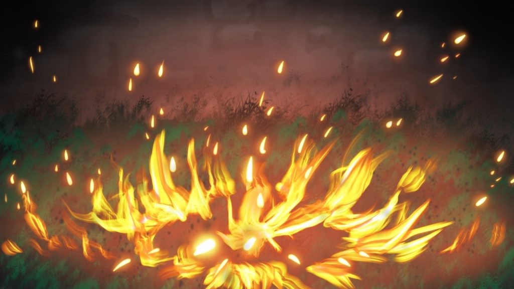
But if I remove all the lighting effects, save the flames themselves:
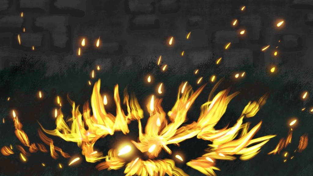
Lighting really does make a huge difference.
I did remove the shadow effects as well in example above, as shadow is also a result of light flow. Here is the same image with shadow but no light:
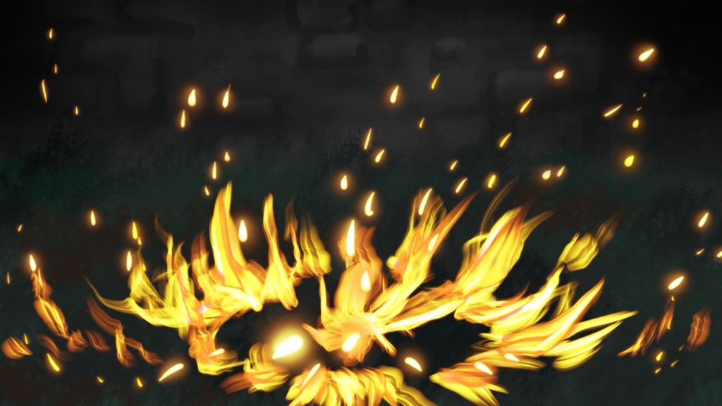
It’s a subtle difference — basically I just made the background darker, particularly in the corners away from the fire. It’s a step in the right direction, but shadow by itself is only half the effect — though in this picture, it’s probably more like only a quarter to an eighth of the effect.
PRO TIP — To make shadows look great on digital software: (a) Either use the multiple or darken layer blend mode — whichever works best for your piece — and a soft brush with any shade from light grey in a sunny picture to pure black for a nighttime one. (b) Use the normal layer mode, but use a soft pure black brush and turn down the opacity to whatever suits your needs. I used 50-60% opacity for my shadows on normal mode.
However, I did use method (a) as well. And for both methods I used, I created a block area of shadow, then used a layer mask and soft brush to erase whatever parts of the shadow I didn’t want.
Here’s an example of one shadow with the layer mask turned off:
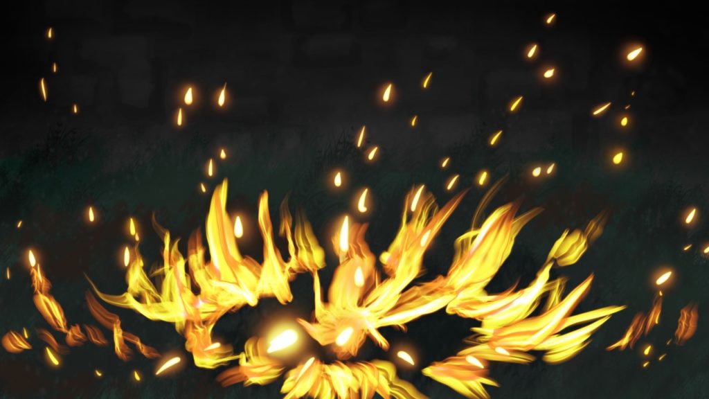
If you closely between this picture and the one before it, you’ll see the shadows in the top middle have deepened. That’s because I turned the layer mask off to make my point, whereas before I had it on in anticipation of the light to come.
Right! Enough about shadows. Let’s get onto the second (and most important part) of this lecture:
Light!
So, let’s add some light to the background to see what effect it has:
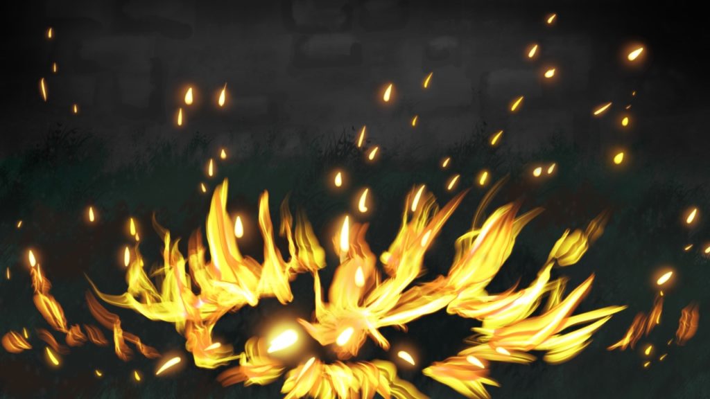
Again, the difference is quite subtle, but I have turned back on the layer mask to reduce the shadows, and added a wide swath of white light in preparation for my fire glow, at a very low opacity (5%) on normal layer mode. Why bother with the barely noticeable white light?
It strengthens the overall effect later on.
Now, if I add some red glow in the background:
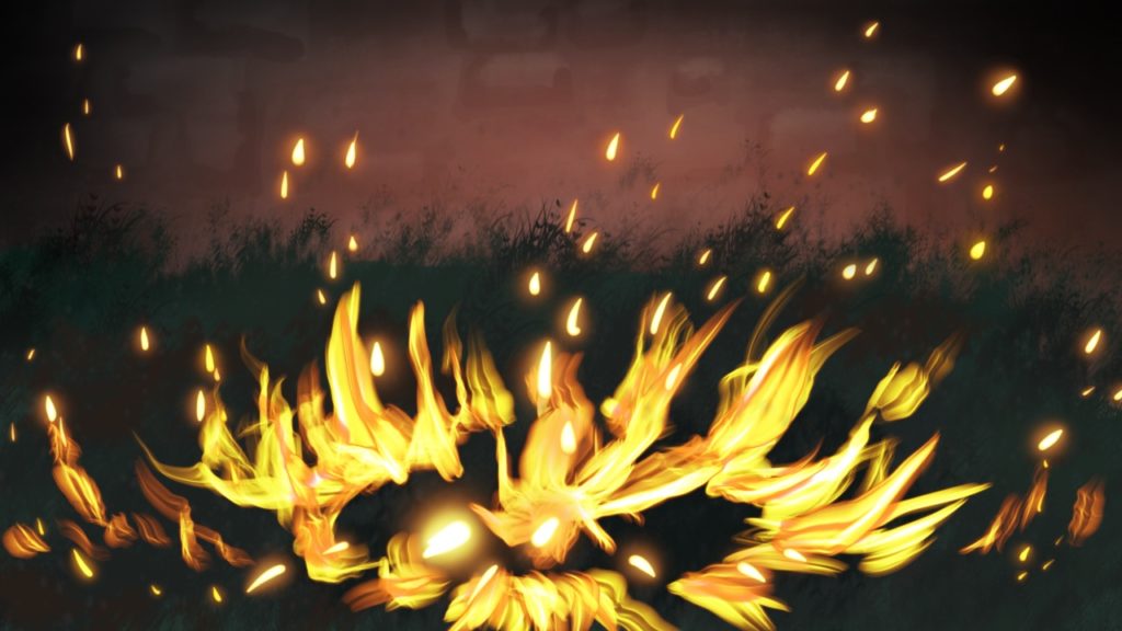
Wow! That’s already made a difference, and at the moment, the light is confined to the background alone, behind the grass and fire layers.
The two red glow layers seen here were made using a soft brush on the Add layer blend mode, both set to 67-68% opacity. Add is an excellent mode for light effects, although I barely ever use it at full opacity, as the effect is much subtler and better nuanced when you turn the opacity down. A full Add effect can be overwhelming and extremely bright, depending.
I should add that besides light in and of itself, coloured light will give a much more vibrant effect, depending on what you want. Here, I want you to almost be able to feel the heat in the air, so I’m using reds to make the whole picture feel warm.
But you can use colder colours in light as well — here’s an example of cold blue light in a picture that precedes this fire:
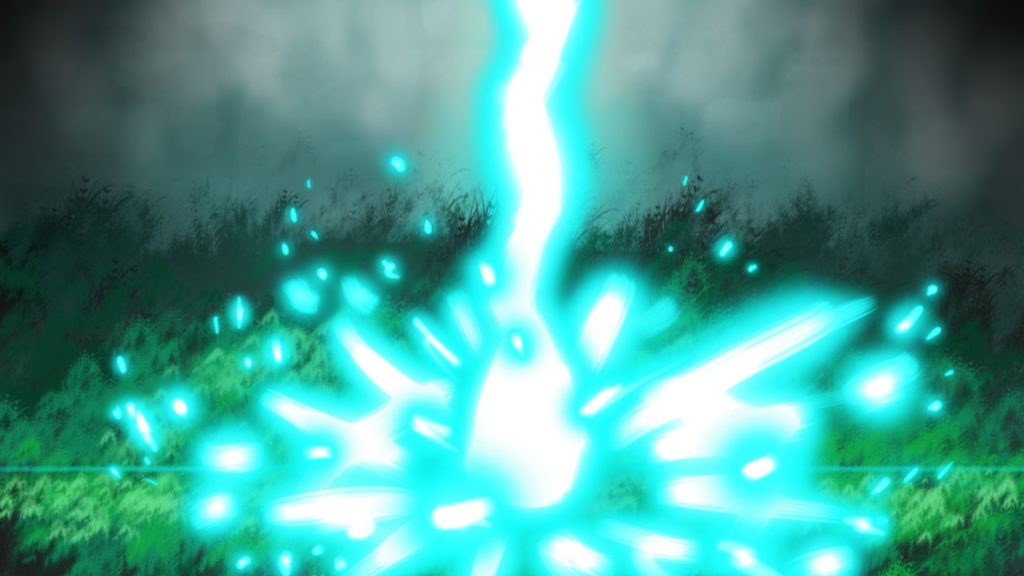
The feel of the light is very different in this picture — a lot colder, crisper. It’s a lot of fun to play around with colours in lighting — you can get some pretty amazing effects.
Back to our fire, here’s the next piece of light I added — this time I added light to the grass. Grass near a fire won’t be dark, and while I haven’t added any red glow to grass yet, it still makes sense for the grass to be lighter on its own:
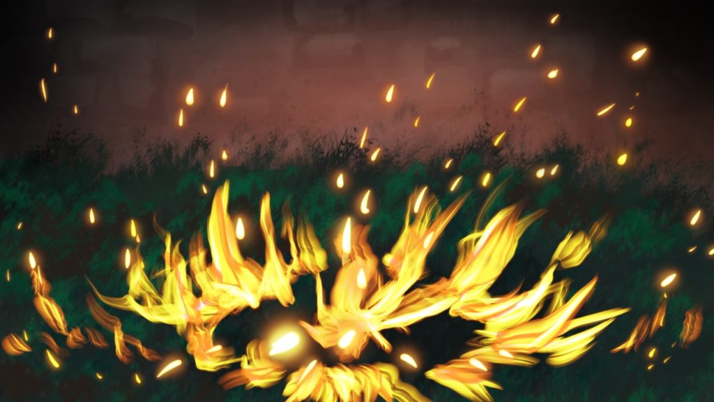
Next, I add the red glow to the grass, again with the Add effect — already the whole picture is glowing with warmth! Isn’t it awesome what you can do with a little light and colour?😁:
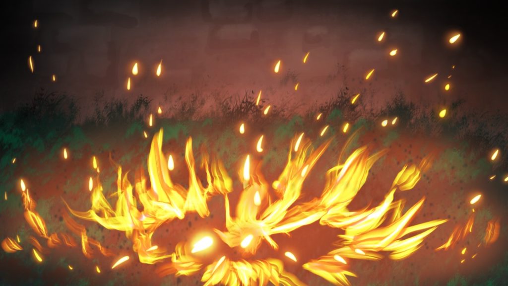
For the finishing touch, I added more red glow to the sides of the fire. I can actually nearly feel the heat and hear the crackles of the flames and sparks just looking at it now. What about you?😉:
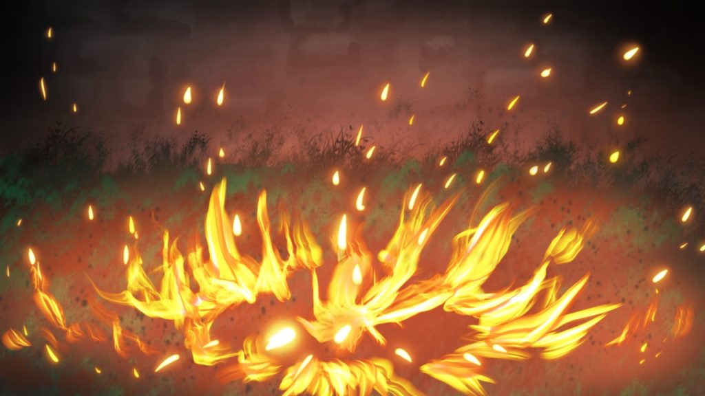
Light seriously is the most powerful tool for making your art look epic!
(A side note for anyone who picked up on this — I did have some of the burnt grass layers turned off in the original — if you look at the grass on the left, you can see the difference between the original and this walkthrough recreation of you want to. Just thought I’d own up — I didn’t notice it until the very end, although I knew something was annoying me about it.)
I think I might have to make a series of walkthroughs about light. Firelight is an obvious one to talk about, but there are so many other illustrations I’ve made where I could show you the awesome effects you can achieve by using lighting!
Lighting is epic.😁
Your turn, Storykeepers! What is your favourite way of using lighting to enhance your illustrations’ awesomeness and mood? And would you like me to make a series of walkthroughs about using light in art? Let me know in the comments!

Those are really cool pictures, do you have any advice on shading?
Not yet, but I’m going to have a blog partially covering a different aspect of lighting this week — stay tuned.😉
Lighting is so powerful! I love using lighting in my pictures, it makes them look nice!